This section explains how to render charts in an ODS template; charts whose data is dynamically computed by pod.
Suppose we have have a context with the following set of data, that was felt so crucial that it probably deserves several graphical representations.
from appy.model.utils import Object as O
entries = [
  O(name='G', value=10),
  O(name='T', value=20),
  O(name='F', value=35),
  O(name='V', value=25),
  O(name='K', value=10),
]
Don't pay attention to the Object class: it is just a convenient class allowing to define objects with arbitrary attributes. I could have used Python dicts instead; but I generally prefer the parameters-by-name notation, being more concise and elegant.
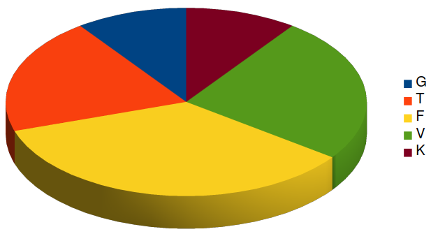
Your linx eye has probably noticed that every entry represents some part of a whole, as a percentage (the sum of all values being 100).
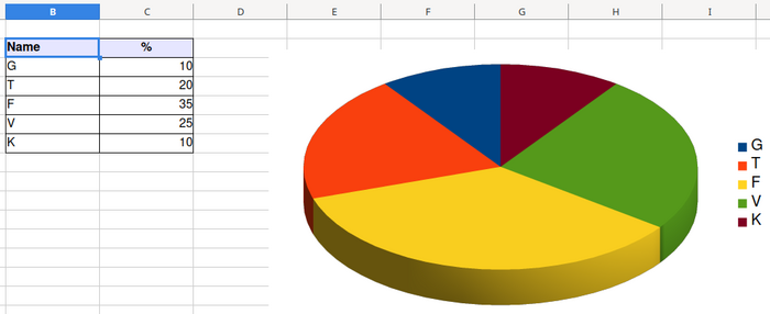
Here is the result we would like to achieve, based on this data.
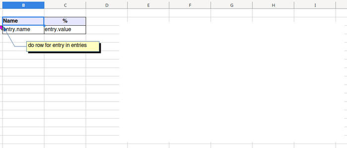
Let's create an ODS template, with a sheet named Pie. If we make the assumption your template will get variable entries in its context, define the following cells in the sheet.
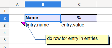
2 columns come into play:
- the first one (B) will host names of the parts;
- the second one (C) will host the percentages.
A pod do row statement will repeat line 3 as many times as there are items in the entries list.
As usual, cells B3 and B4 must contain pod expressions surrounded by double quotes and prefixed with the "equal" sign.
B3 contains:
="entry.name"
B4 contains:
="entry.value"
Because, in every sub-object, the value attribute stores an integer value, the corresponding cell will host a true integer value, too.
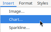
In the same sheet, add a chart. With LibreOffice, use menu Insert > Chart ...
Select Pie as chart type:
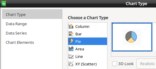
Don't mind now about the other datasets (Data Range, Data Series,...) and click on button Finish.

Now, position and resize your chart as you want, and you should achieve a result like this one.
For now, the most negative people among you may think that the chart is a bit minimalistic. Indeed, LibreOffice has no idea about the data to use to render it. Even if we suggest to him that the data range will be somewhere in columns B and C, we don't know the precise number of entries that will be injected at pod rendering time. That being said, in order for the pod magick to take place, we will cheat with the graphic name and insert, in it, a pod-specific specifier. Please right-click on your almost-chart and edit its name.
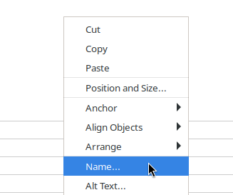
Give him this name.

This name is made of 3 parts. It tells pod: « For that chart, use range B2-C3 as it will be expanded, at pod generation time, via variable entries ». Elements must be separated by dashes.
We are gone!
Render your ODS template and you should get a result being similar the following one.
Customizing a chart with a GraphicProperties object
In the previous example, chart properties were all default ones.
Appy offers you (for free) class GraphicProperties (available in the standard pod context) allowing to fine-tune graphical details.
Here is an example.
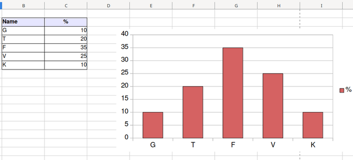
Suppose you want to render a Column chart, with the same set of data as in the hereabove example, and whose fill and stroke characteristics have been carefully selected by your acute artistic sensitivity. Besides the do row statement, add a variable definition that creates an instance of the GraphicProperties object.

The plus sign besides the with keyword is required to extend the life of the variable (making it lasting), that will need to be accessible to pod once the chart will be met, further in the sheet.
When specifying a GraphicProperties object, its name must be added as the 4th part of the graphic name.

With these settings, you should get a result like the following one.
Have a look at class GraphicProperties' constructor. The class can be found in appy/pod/graphic.py.
 def __init__(self, stroke='none', strokeColor='#b3b3b3', fill='solid',
fillColor='#004586', fontSize='10pt'):
self.stroke = stroke # Possible values: 'none', 'solid', ...
self.strokeColor = strokeColor
self.fill = fill # Possible values: 'none', 'solid', ...
self.fillColor = fillColor
self.fontSize = fontSize
Please note that single set of fill- and stroke- characteristics may be defined. For a pie chart, it is ignored because every part must get a specific color.